That leaves me MORE time to investigate duplicate-cover-image scandals (not really a scandal, I'm just a nerd), and carefully select a Fabio-esque cover for your Friday enjoyment. And other things I haven't even thought of yet. I like to keep you all on your toes (and by 'all' I mean the 6 people who read this. Or maybe the 6 Google bots who visit the blog).
I've been in two minds about this pick as STRANGELY enough it shares exactly the same colour scheme as my last pick of the week. Either I am exceedingly limited in my taste in covers, or it's just some big coinkidink.
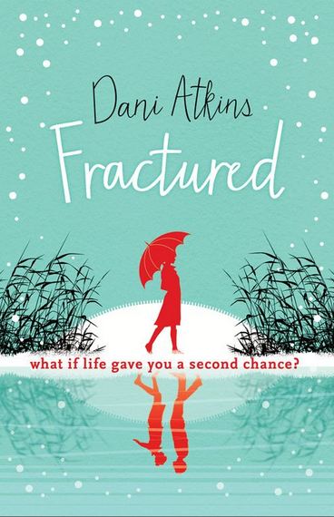
Title: Fractured
Author: Dani Atkins
Publisher: Head of Zeus
Cover Artist: Unknown (please let me know so I can credit!)
Genre: Contemporary Romance
SCORES OUT OF 5
What's to love...Maybe it's my recent 'discovery' of Mad Men, but I'm liking this retro 'flat' style of illustration. The contrast of hot red against cool sea-green makes it pop. The black line art helps balance out the whole composition and gives some hint at dark things in the past or to come.
The split caused by the 'reflection' is a great mechanism, and ties the title into the composition for me - 'Fractured'. I already get a sense of a person in two parts, or a story in two chapters. So what will it take to flip the whole thing around and it be a couple greeting each other joyfully and not just a woman walking alone? I do so like a cover that makes me wonder...
Author: Dani Atkins
Publisher: Head of Zeus
Cover Artist: Unknown (please let me know so I can credit!)
Genre: Contemporary Romance

SCORES OUT OF 5
Thumbnail-ability: 4
Font & Text: 3.5
Genre-fit: 3
Overall Composition: 4.5
Overall Concept: 4
OVERALL SCORE: 3.8
The split caused by the 'reflection' is a great mechanism, and ties the title into the composition for me - 'Fractured'. I already get a sense of a person in two parts, or a story in two chapters. So what will it take to flip the whole thing around and it be a couple greeting each other joyfully and not just a woman walking alone? I do so like a cover that makes me wonder...
No comments:
Post a Comment