Showing posts with label romance novel covers. Show all posts

Monday, 31 December 2018

Kindle Romance Covers of the Week - 30th December 2018


I've said this a few times before on this blog, I'm sure. But I do so judge a book by its cover. That might not be right. Or fair to the writing. Particularly if the author hasn't had total control over the final design of that cover (traditionally published) or struggles to find the resources to hire a great cover artist (self-published). 

But I am totally sucked in (or totally put off) a book by what it looks like. And I don't think I'm alone.

So I'm back doing what I did some years back which was to trawl through the latest releases on Amazon Kindle (they aren't paying me, I wish. I haven't even got affiliate links sorted out, folks) in the past 30 days and grabbing a few of my favorites, which you can see in composite (in no particular order) above. In this case, I filtered specifically on Contemporary Romance, as I'm doing my own tiny bit of market research.

The things that typically make me want to read the back cover copy:
  • Font choice and use of font (see above, 'There Was This Boy')
  • Color (see above, 'Love You', 'Lost and Found'
  • Balance of text/image (see above, 'Romy and Juliet', 'Wall of Flowers')
  • Novelty (have I seen this a million times before? See above, 'Dateless' - interesting camera angle)
  • Tie between the image and title that isn't the usual generic clinch/abs that gives me a stronger sense of the contents (see above, 'Love Unleashed', First Time Player')

...among other things my subconscious is most certainly doing on my behalf that I have no clue about :)

Sunday, 12 May 2013

Kindle Romance Covers of the Week - 12th May 2013

Okay, here we go! I've done my wander through a week of written Romance, and pulled out what I think is the best and beautiful in Kindle Romance Covers. And yes, I took a week off, partly due to busyness but also due to there being a strange lull in good covers. I found a few reasonable ones, but not enough to write home about. Of course, this week I found more than you can shake a stick at, and I'm up to the brim with loverly-coverly goodness!

Before I get started, some words for anyone joining the party for the first time. I review covers of Kindle eBooks published in the past week on Amazon UK  categorised as 'Romance'. I have no affiliation with Amazon or Kindle, nor do they line my (empty) pockets in any way. It's just an easy way for me to gather a manageable number of covers and pick out my favourites!

And for my usual, secondary disclaimer: I have no idea if the writing IN these books is any good. I will read the blurbs to see how the cover art ties into the story/genre, but that's IT. Any judgement of writing quality is up to YOU, fair reader. I just look for prettiness!

Before I get to the runners-up, I have a few things to note:

OOPS, YOU DID IT AGAIN

That's right. Now that I've started to spot trends in repeated images used in cover art, I am obsessed with spotting Wore-The-Same-Dress-To-The-Ball incidences. Here's your dose of duplication for this week - and YES, they were both releases in the SAME WEEK.

To be entirely fair to authors, cover designers and publishers alike, how would you know that someone else is going to pick the exact, same image from a database and release those precise books in the same week? You don't. But it's an unfortunate mishap for these two authors. I will say, I much prefer the cover of 'Beyond a Doubt' by Felicia Rogers - the text on 'Lady Catherine Brandon's Leap Day Adventure' is almost entirely unreadable! 

TREND SPOTTING: SUN'S OUT, GUNS OUT

Sorry. I heard that phrase for the first time this week and can't get it out of my head. The Urban Dictionary tells me it has something to do with muscly young men wanting to get their kit off and wear short sleeves the moment the temperature goes above 15C to show off their 'guns' (a.k.a. arms/biceps). But I'm talking about LADIES with guns. Real ones. Noticed a number of covers with strong women and their not-so-concealed-carrying.
And for the first of this week's runners up...

CUDDLY COUPLES

I'm usually really NOT into the clutchy-couples thing on romance covers, but this week showed up a little crop of rather decent ones! For me, if you going to show both protagonists on the cover, it's got to be more than just a way of indicating whether it's a Scottish historical (KILTS! SWORDS! BOSOMS!) or a vampire fantasy (NECKS! FANGS! BLOOD!). I want to see emotion in the interaction between the couple, not just pretty bodies.

Title: Forces of Nature
Author: Cheris Hodges
Publisher: Kensington Books
Cover Artist: n/a
Genre: Contemporary Romance

This upside-down-backwards-Spidey-kiss pose seems incredibly popular these days, don't you think? But this cover does work, and the fact that our couple are canoodling on the grass (something I always found more romantic in one's mind than in reality. Grass itch. Ants. Dog walkers. Say no more.), is a nice change. What pulled me to this cover was the palpable tenderness between the couple. I'm all about a cover expressing something, particularly emotion. The font and title are nicely spaced, contrast well, and don't interfere with the main image. The fact that the story revolves around a farm (nature), and they're rolling around in the grass (nature!), ties right into the title. The pose may seem relaxed, but you could stretch this a little and say that they are still at cross-purposes with each other, just a little, which adds a nice tension.

Title: Lost in You
Author: Heidi McLaughlin
Publisher: Mad Beak Publishing
Cover Artist: Sarah Hansen - Okay Creations
Genre: Contemporary Romance

Maybe it's thoughts of moving to Texas someday, but I have a fascination with the way a southern girl can put together a dainty dress and a pair of boots and it just looks darn-tootin' good. (I should stop talking like that. Okay. I will stop talking like that). Not sure I have the calves  for it, but I might try it someday. [FOCUS, BEATRICE.] Yes, so...the cover!

I've decided that I often prefer it when the models on covers have their heads cropped out of the image. Sounds brutal, I know ("OFF with their heads!!"), but while I want to get a FEEL for who the characters are from the cover, I want my imagination free to roam when I start reading. I don't want to be trapped into one impression of some actual, real people who are not actually the characters in the story, no matter how well their hair colour or chin-cleft matches their descriptions. So I'm a fan of this one - I can tell something instantly about our gal (well dressed, confident), and our guy is a little more down-to-earth, boy-next-door. That, and he has her a little bit backed into a corner, so to speak. The blurb backs this up, so I'm giving this one a thumbs up. Oh, and the colours are verrry pretty!

Title: Connected
Author: Kim Karr
Publisher: Penguin
Cover Artist: Unknown - re-released with Penguin
Genre: Contemporary Romance

I actually worry about how fascinated I get by design amendments and alterations. Befores and Afters. Version 1s and Version 2s. Here's a great example of what the most subtle changes can do for a cover. I picked Kim Karr's Connected out of the line-up this week, not knowing that there was a first version from her self-published (assuming - correct me if I'm wrong!) edition of the book (Version #1 below, in black & white). The version I spotted was Version #2, in colour.

Maybe it's my imagination, but just the colour change alone changes the mood entirely. From dark and brooding in greyscale, the colour version is much warmer, sexier and approachable. The photograph is identical in composition, but just the change in colouring and contrast and the new position of the title mean we can see that her arms are actually wrapped around his waist. This means he goes from looking slightly more overpowering in V#1 to her almost holding his hands behind his back in V#2. Hey presto, you have a complete change in relationship dynamic. We're very attuned to body language, and what you show vs what you reveal is incredibly important.

The colour version has a much clearer version of the title, but I love that they've kept the pink/grey mirroring of the word. Symbolism in a title and in the text is a big winner for me, and to have mirroring/ying-yang/feminine-masculine all tied into a word like 'Connected' is perfect. I'm voting for Version #2 (fingers crossed it's actually the current one!).
Version #1
Version #2


ALL THE SINGLE LADIES

Okay, so my secret's out. I'm not generally a big fan or follower of pop music, but I've always thought Beyonce was pretty incredible. Though I did get in trouble thanks to her 'Single Ladies' song at a party once. Apparently the birthday girl was celebrating her recent split with her ex, and specifically wanted to celebrate with all the OTHER single ladies. I just liked the song, so got up and did my thing (in other words, I swayed to the music and shuffled my feet a bit. A dancer I am NOT). That was until I was firmly chastised by the birthday girl for dancing to a song about 'single ladies' when I was, in fact, a MARRIED WOMAN. Shock. Horror. \Tail between my legs, I scuttled back to my table. Won't be making THAT mistake again. But if I ever need cheering up, there's nothing like that video of the baby busting a move to Beyonce to do the trick!

Title: Breathe
Author: Ani San
Publisher: Amazon/Self-published
Cover Artist: Ani San
Genre: Contemporary Romance

What's not to like? Clean, clear design. The font style works beautifully with the wavy lines of her hair. It's all about contrast and leaving room for that all-important (and in this case, literal) 'white space'. Simple, and lovely.


Title: In My Own Shadow
Author: Susan A. Royal
Publisher: Museit Up Publishing
Cover Artist: Marion Sipe
Genre: Fantasy/Paranormal ROmance

In contrast, this cover has a whole lot going on, but then again, so does the plot. There's time-travel, a Book of Secrets, telepaths, and alternate universes. What grabbed me particularly is the girl, her face, and again...the emotion. Lost, but strong, you want to find out what she's about to go through. The actual echo/shadow on the word, Shadow, is very clever, and pulls the title together with the fact our protagonist has an alternate in this alternate dimension. Careful placement of the elements keeps this from being what could be a very busy cover.

Title: Cursed
Author: Jennifer L. Armentrout
Publisher: Hodder & Stoughton
Cover Artist: n/a
Genre: Young (or New?) Adult/Fantasy/Romance

More lying down in grass! Okay, so maybe we all do a whole lot more of this since Bella and Edward went daisy-swimming and we met the sparkly people. But I do like this cover, and with the story appearing to be about/for a younger audience, I think it's fitting. I like the fact she's posed upside down, which gives us some idea that things have gotten rather topsy-turvy (do people even SAY that any more?!) in her world. Simple, but evocative.


Title: Pieces of You
Author: Cassia Leo
Publisher: Amazon/Self-published
Cover Artist: Sarah Hansen - Okay Creations
Genre: Contemporary Romance

Could it be? Am I a new-found fan of Sarah Hansen's cover designs? Have a lookey up at our cowgirl cover. That's right, Sarah is listed as the designer for Lost In You as well! Someone's been busy. This time we have only one of our characters on the cover but we've also got an expression and emotion that we have ALL felt at some point at some time. More lying-upon-the-ground (sensing a theme here), but it indicates to us a lowness - of mood, of spirit, you name it. Rock bottom emotions. The perception of depth in the image makes us want to get closer to her. The title, and presumably those things about him that are Pieces of You, appear to weigh on her and press her down. Gorgeous, soft colours.


PICK OF THE WEEK

Title: Reclaim My Heart
Author: Donna Fasano
Publisher: Hard Knocks Books
Cover Artist: Najla Qambar (Updated - thanks for Najla's info, Donna!)
Genre: Contemporary Romance

I love this cover more every time I look at it. It has contrast, dark and light, green and red. A perfect example of how on a very basic level you can make complementary colour schemes work for you (green in the background, red in the figures and the title). It gives the whole image a 'buzz' and unconventional harmony like nothing else.

I've actually seen these figures before, photoshopped differently, on another cover. But I much prefer this full-length version of them, and the additions that have been made to personalise the characters. The male character in this story belongs to the Delaware Tribe/Nation, something we may be asked to pick up on immediately from the tattoo on his arm.

Whatever stock image was used originally, the treatment of it here has imbued the couple with a vulnerability, a delicacy of emotion, a poignancy and a threat of darkness which is both beautiful and intriguing.


I hope you enjoyed this as much as I did. Let me know what your favourites were, or if you thought I missed the GEM of the week!

But before we go, would I let you get away without...

ABS OF THE WEEK AWARD!

That's right. can't live without a little dose of manly perfection (KILTS! SWORDS! BOSOMS!). Okay, maybe man-bosoms in this case. 

See you next time!


Top background image Copyright (c) 123RF Stock Photos (with a few little amendments by moi)

Follow my blog with Bloglovin

Tuesday, 7 May 2013

Sextuplets! Or, How to Avoid Embarrassing Book Cover Doppelgangers

Fingerprints. Snowflakes. DNA. That's how unique you want your book's cover image to be, right? Why would you want to copy anyone else? Why would you want your book mistaken for someone else's?

In the wonderful world of indie-press and self-pub, low-budget and home-made covers abound. Some are shockingly bad, but as I've discovered during my weekly Kindle Romance Cover reviews, I have to admit the quality is rapidly improving.

But quality aside, the way the indie-press/self-pub world goes about gleaning images from the internet at large appears to be creating a slightly bigger problem. Let me explain.


This had me wondering. If the exact same image could crop up on two books within a week, how many other times had the same image been used?

The answer (from what I could find, just digging through Google Images), was a little startling.

SEXTUPLETS!

That's right. Here are six separate book covers, all published at some point using the EXACT, same image.


(Granted, at least one of these titles is now published using a different image - maybe they caught on?)

SO WHAT?

Okay, you think, So what? So what if other books have the same cover? But... what if that's not the only place your lovely book cover image has been used on the internet? Again, a simple Google search shows that the above image can be found illustrating:

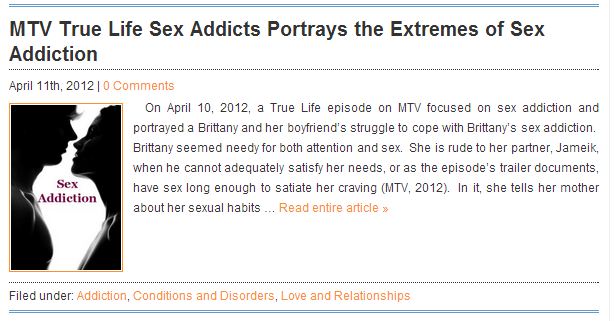
And just in case we haven't caught onto the theme here, we have the image with 'Sex Addiction' plastered all over it. Nice.


So yeah.  Now your 'smexy romance' is associated with sex addiction articles. Not quite so smart, and not so sexy after all?

AVOID

So, how to avoid the Wore The Same Dress to the Ball mistake?

There are no guarantees, mistakes can always creep in. With the proliferation of images on the internet there is no way to ensure that no one uses your cover image ever ever

But a few things to try, and will at least ensure your use of the image is unique:
  • Enlist a reputable cover artist who does original work and uses exclusive images
  • Ask for exclusive rights on the photograph used for your cover
  • Design your own, don't use stock images
  • Please, use that little Google image search, lovely people, and check before you use a picture. It might save you a little embarrassment. And perhaps a few copyright lawsuits!

~~~~~~~~~~~~~~~~~~~~
UPDATE - 10th May 2013
One week on, and you guessed it. I found ANOTHER ONE...Seven and counting.

~~~~~~~~~~~~~~~~~~~~
UPDATE - 17th June 2013
Just spotted yet another hapless author who's got which picture on their cover? You guessed it...


~~~~~~~~~~~~~~~~~~~~
UPDATE - 18th June 2013
Did another image search just for kicks (when did this turn into my latest hobby?!) and found...a few more. ELEVEN and counting, folks! 


As well the image used in a few other places:

An album cover:

...and a 'Christian Sexuality' video:


Stay tuned...you can bet there will be more!

~~~~~~~~~~~~~~~~~~~~
UPDATE - 24 June 2013
That's right folks...it just never ends. SEVENTEEN books, people. -={ 17 }=-


(Okay, have listed this book already above, but it is a different design!)


And in other languages...


Are there NO more pictures in the ENTIRE WORLD?

But this might explain at least one of these covers. YOURS (and many others')...for only $25:


o_O


~~~~~~~~~~~~~~~~~~~~
UPDATE - 24 June 2013
Now, this is technically a series, so not sure if it's fair to count these as three separate books, but by golly they ARE and I WILL. That's now TWENTY books, people. -={ 20 }=-


Tilting the image a bit to change the body language? Interesting...


Done a little photoshopping to change the heights, have we? So sneaky...


And even here they've changed it just a little to make her more level with him. SAME PICTURE, folks!
('Everything' except a unique cover photo, it seems...)

Keep your eyes peeled for more - you just know this won't stop here, don't you?

~~~~~~~~~~~~~~~~~~~~
UPDATE - 22 January 2017 
Thought it was about time to (gently) scour the interwebs for any recent editions to my hall of shame.

Ah, here's one...(nice use of barbed wire)


Surely there aren't more...oh, I tell a lie...


Oops, and one more...


And another (oh, the irony..."first sight"..)


This one's making me a little blue...


And a foreign book...thank you Harper Collins, for this original image. 


By my count that's now -={ 26 }=- books with this cover. *sigh*


Sunday, 21 April 2013

Kindle Romance Covers of the Week - 21st April 2013

It's that time again! I've romped through the recently released romances as if they were a field full of spring flowers, and picked out my favourite covers for another week. I can't promise to be able to do this every week, but I got such a great response to the last two that I can't help keeping it going.

You'll note that I don't use any form of scientific analysis, scoring or other formal evaluation. I just pick out what I LIKE. So, the following is entirely my personal and purely subjective opinion. No critics were injured in the writing of this blog post.

And as ever, My Disclaimer: I haven't the foggiest if the following books are the next big sensation, or if they'll end up in your e-reader's DNF folder. I leave the reviewing of any contents to the experts (and to you, Dear Reader).

But first...

VICTORIA DAHL - TOO HOT TO HANDLE

That's right, folks, Victoria Dahl's latest full-length novel is now available in the UK on Kindle! Was chuffed to see this cover pull through into the list this week. If you don't already follow Victoria on Twitter, you are missing out on serious entertainment. As for the cover, I love the bold, fresh 'non-regulation-issue' colours she uses. And who can resist a pillow fight?


TREND SPOTTING: IT'S ALL ABOUT THE MONOCHROME

I'm only going to pick on one trend this week, as it seems to be a rather BIG one. And I confess, I'm cheating a little, as I was curious about trends in the most POPULAR books from the Hot Release section (ebooks published on Amazon in the past 30 days).

With all the spring colour bursting up with the first warm weather we've had, I was sort of expecting to see a lot more vibrant Romance covers in the Popular list. But it seems the 50 Shades effect is still firmly with us, and all I can see is wall to wall shades of grey/blue/brown...monochrome.

Okay, there are a few with contrasting colour in the titles, but I was shocked at how many of the top 50 titles went for the two-toned look. It must appeal to readers though, as many buy a book by judging the cover, right (I know you do...you DO)?


RUNNERS UP!

LOVELY COUPLES

Here are some of my faves from this week - nice cozy couples (see? I don't just go for weird, abstract, dino-slipper covers!)

Title: Scarlet Heat
Author: Evangeline Anderson
Publisher: Evangeline Anderson Books
Genre: Fantasy/Paranormal Romance

This is probably the closest I get to putting a stamp of approval on a 'traditional' Romance cover (i.e. barely-clothed dramatic/passionate couple, wrapped in a torrid embrace)! She's a reluctant vampire, he's a secret werewolf with a cross-species marriage of (in)convenience thrown in. What I liked was the whole balance of colour - the gentleness of the figures, which leans more towards tender than raving-lust-filled, and the combination of title fonts. It's very pleasing on the eye. Though for all that, Evangeline does promise "Lots and lots of steamy sex." o_O

Title: Falling into Forever
Author: Lauren Abrams
Publisher: Amazon/Self-Published
Genre: New Adult Contemporary Romance

Simple, uncomplicated composition. Another in the 'monochrome' theme, but the simplicity is sexy, I think. At first I thought this might be another vampire romance, based on the neck-nibbling. But it's listed as Contemporary New Adult, set in New York and involves a hunky movie star and a lost love. Verdict: Simple and sensual. 

Title: Faster We Burn
Author: Chelsea M Cameron
Publisher: Amazon/Self-Published
Genre: New Adult Contemporary Romance

Love the soft colours on this cover, with the flowing text over-top of the cuddling lovers. The way the hands are just touching is tender and intimate - makes me want to know what's going to happen between these two. It also gives a much gentler and vulnerable impression than the story blurb - hoping the inside and outside line up! The only thing that kept this cover from being my favourite of the week was that for me, the title blended into the background picture. Even in this size, its hard to make out the words, and in an Amazon-size thumbnail, the contrast was too low to read it at all. otherwise, it's a lovely combination!


LONELY LADIES

In which I prove to have a weird thing for women's necks. Apparently. 

Title: Shades of Truth
Author: C.L. Stockton
Publisher: Amazon/Self-Published
Genre: Historical Romance

It's hard to go wrong when you start with such a pretty photograph. The tendrils of hair are nicely echoed in the swirl of the h in 'Truth'. The fine, dark lines of her hair, the text and the necklace pull the whole piece together. The only thing that lets this cover down (in my opinion), and also out of the running as my pick of the week, is the somewhat claustrophobic thin black border that's been added around the left-hand side. Perhaps without it, it looked too contemporary for a historical romance? Either way, I feel it spoils (just slightly), the tranquillity of the image. But other than that...LOVE.


Title: The Vessel
Author: Felicia Tatum
Publisher: Amazon/Self-Published
Genre: Fantasy/Paranormal Romance

If she touches you, Olivia can see how you'll die. Scott is under a family curse, but can visit Olivia in her dreams. Sound like a rather intriguing set-up? The cover caught my eye - how can you miss all that red hair? Very Pre-Raphaelite. Lovely contrast with the blue, and the pose is very pretty. I believe the rest of her is visible around the back of the printed book, which is clever. Again, slight issue for me with the title text blending into the image (sensing a trend here!).

Title: Ripper - A Love Story
Author: Lance Taubold & Richard Devin
Publisher: 13Thirty Books
Genre: Historical Romance/Thriller

You have to admit, this is the perfect cover for a historical serial killer romance-thriller where the leading man is also a suspect. There's elegant sensuality, mystery and splashes (literally!) of bloody murder. The font is strong and fits well with the historical timeframe. And for that little addition of something chilling, how's the 'telling ghost stories by the campfire' upwards lighting working for you? I'm hooked.

Title: Barely Breathing
Author: Heather Allen
Publisher: Heather Allen
Genre: Fantasy/Paranormal Romance

Not sure if it's just from following the intrepid and incredible Ksenia Anske as she chronicles the writing of her Siren Suicides novel(s), but I see a lot of amazing underwater photography around these days. And where better to utilize it than on a mermaid love story!! Gorgeous muted colours, dramatic pose, and the text against the red is lovely. I can't resist a cover that seems to plunge me into the middle of the story (is she drowning? dead?) before I've even read the first page.

LAST BUT BY NO MEANS LEAST...

No neat categories for these other than 'I LIKE'. And I'll have to suspense my analysis for now or this post will be out just before Christmas 2014 (if we're lucky).

Title: Cross Currents
Author: Beatrice Aird O'Hanlon
Publisher: SilverWood Books
Genre: Contemporary Romance

Title: Poison
Author: Sarah Pinborough
Publisher: Gollancz
Genre: Fantasy Fairy Tale Romance

Title: Second Hand Lace
Author: Jenna Lehne
Publisher: Turquoise Morning Press
Genre: Paranormal Romance


Drum roll please...

PICK OF THE WEEK

I actually surprised myself with this one. As you can probably tell, I gravitate towards moody, dramatic images with lots of contrast. But each time I went through the covers, this one kept grabbing me. Okay, so on the surface it has a feel of that 'Chic Lit' clip-art feel that we've come to love/loathe. But somehow this one goes further.

I think what I love about it is the pink calligraphy. I've seen some of those old, original manuscripts where the scribe just went bonkers (or got bored) and did more swirls of the pen than seemed entirely necessary, and that's exactly what we have here. That or a wedding invitation gone horribly and irrevocably wrong. It's the way the calligraphy then tangles with the other little elements which pulls it all together for me. The title is still clear and readable (a miracle, in all those swoops and swishes), and it's just...FUN. (Yes. I occasionally dabble in...fun.)


Title: Brave Hart (One Woman's Search for that Most Elusive of Things, a Happy Ending)
Author: Kristofer Spyrou
Publisher: Amazon/Self-Publish
Genre: Contemporary/Humour Romance


Not to be forgotten....

ABS OF THE WEEK AWARD!!

I'm sorry, but this man's arms HAVE THEIR OWN ABS. Is that even possible?!


PUBLIC SERVICE ANNOUNCEMENT

Before I go, a few words of warning.

Beware of George Wickham...especially if he has a glowing eye. o_O
Beware the disembodied hand. With a ring.
Beware the Grammar Police if this is your title. Eep.
There are no words.


Hope you enjoyed this as much as I did - See you all next week!


eReader-with-books image Copyright (c) 123RF Stock Photos (with some editing from me!)